Adds content to button react examples#7607
Conversation
|
Preview: https://patternfly-react-pr-7607.surge.sh A11y report: https://patternfly-react-pr-7607-a11y.surge.sh |
 mcarrano
left a comment
mcarrano
left a comment
There was a problem hiding this comment.
@edonehoo in general I think this looks great and is consistent with what I was expecting. I just made a few suggestions for rewording a few of the example descriptions.
@mmenestr it would also be good for you to review this. It may be that some of the information here becomes redundant with the design guidelines, and it's possible it makes more sense to live inline with the examples. Interested in your thoughts bout that.
 thatblindgeye
left a comment
thatblindgeye
left a comment
There was a problem hiding this comment.
Awesome job on this! Really digging the additional info provided for these examples 🔥 Had some comments below, let me know what you think! 🙂
Yes, I think this sort of thing can be very helpful and was kind of what I hoped this documentation would be. It may be hard for @edonehoo to come up with all that nuance, but it would be helpful for you or another developer to point out the things that a developer should know as they look at these examples.
I also see this process as one of making out examples more relevant and meaningful as between the live examples and the documentation, it should tell a story of what this component is and how to use it |
Appreciate all the feedback so far. A lot of everyone's insight related directly to the questions I was planning to bring up in Thursday's check-in, so this has been helpful! Working on integrating all of this into an update. @mcarrano I agree that many of @thatblindgeye technical add-ons make a lot of sense to include. It does lead me to wonder about the most efficient way that I can draft these edits without making it too tedious for engineers to have to come in and add nuance or functionality that I'm not aware of. For example, I tried to understand the aria stuff on my own and ended up being a little off. & then when it comes to the control variant (which oops I didn't notice on PF), tooltip support, etc. -- there are things I struggle to find context on entirely. I definitely don't mind taking a swing and missing, but I'm trying to be cognizant of assuming too much. Ultimately I'm just hoping it's not too troublesome to review! |
|
@edonehoo this looks great so far, thanks for tackling this ! I don't think you need to be an expert with the technical stuff, just having someone sit down and take the time to add this text is really helpful and gets the ball rolling, so don't worry about the review work too much - the devs are here to suggest technical feedback haha! @mcarrano I honestly wouldn't worry too much about repetition with the design guidelines, especially because I think a lot of people might only look at one or the other (?) I don't think this is worth re-doing the whole structure of our design guidelines over, personally! |
Perfect, sounds good! Wanted to be sure whether that sort of info would be worth including the description first, but will definitely keep that in mind when reviewing future example work as well.
@edonehoo totally agree with Margot, the work you've done already has been great to get things rolling! I also agree in not worrying too much about the technical stuff, but it's also awesome you've tried looking into some of the more technical stuff on your own. If there's ever anything in particular you aren't too sure about you could either mention it in the initial PR comment or you can reach out to Katie or myself (or another dev!), otherwise it's definitely not tedious to review and add comments for that sort of stuff from the dev perspective 🙂 |
|
@mcarrano @evwilkin @thatblindgeye @kmcfaul @mmenestr + etc - I incorporated previous feedback in my latest commit and also took some liberties following today's discussion (rearranged things and messed with headings). Happy to roll back those bigger changes if they're an issue or don't work how I intend, but I think they help visualize what I had in mind. Made content changes too so please lmk if there are typos/misinformation/etc! |
mcarrano
left a comment
There was a problem hiding this comment.
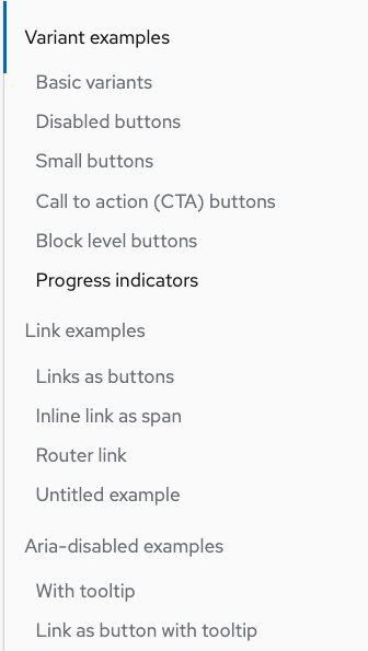
@edonehoo This is looking great. I really like the way you reorganized this. I just had a couple of minor comments. Also, there seems to be a stray heading labeled "Untitled example" at the head of the file when I preview it. But I can't see where that comes from in the source file.
thatblindgeye
left a comment
There was a problem hiding this comment.
Looks good with things reordered! Had some comments/suggestions below for a few examples, but awesome job with the latest update!
|
RE: "Also, there seems to be a stray heading labeled "Untitled example" at the head of the file when I preview it. But I can't see where that comes from in the source file." -- so I removed the existing Examples header because it seemed redundant, but maybe it's something that is required to be at the top of the file? Does anyone know if that's the case? If so, I can just add it back (I don't see the stray header, but I may be overlooking it)! |
 kmcfaul
left a comment
kmcfaul
left a comment
There was a problem hiding this comment.
Overall looking great so far!
| Accessible Rich Internet Applications (ARIA) is a set of roles and attributes specified by the [World Wide Web Consortium](https://www.w3.org/WAI/standards-guidelines/aria/). ARIA defines ways to make web content and web applications more accessible to people with disabilities. | ||
|
|
||
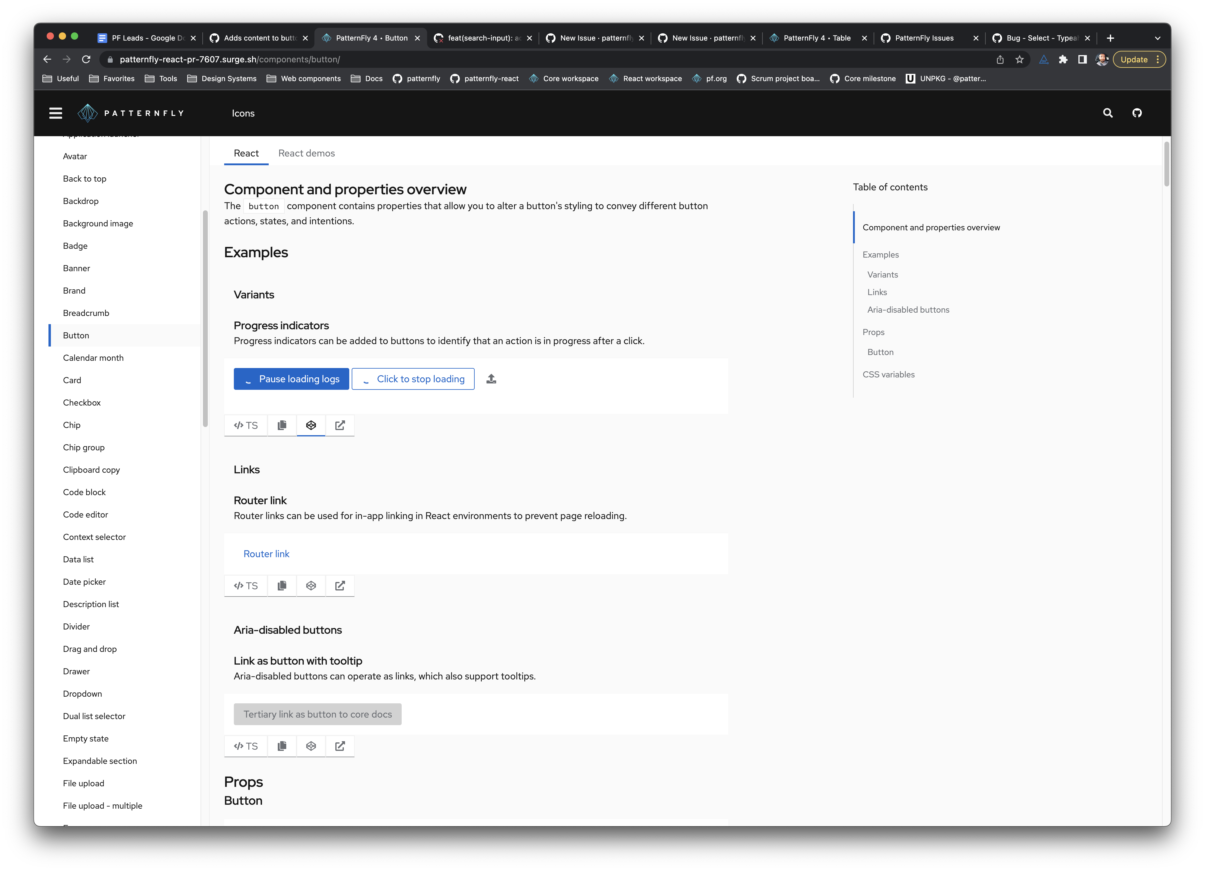
| ### Call to action | ||
| ### Aria disabled buttons |
There was a problem hiding this comment.
It feels redundant to have all three examples state Aria disabled button..., but I'm not sure if titling the subsection Aria disabled button would make it clear enough to adjust the repeated example title text. Maybe Using aria disabled for the section title? Anyone have thoughts about these names?
There was a problem hiding this comment.
That's a fair point I think, and is worth aligning on now since there are other components that have/may have examples laid out like this. I feel like if the section was renamed to "Aria-disabled button", the examples could be renamed to something along the lines of "Basic aria-disabled", "With tooltip", and if we still wanted the example, "Link as button with tooltip". The heading levels plus the way the table of contents is laid out should provide the context that these three examples are for "aria disabled buttons".
The only issue with that might be if there were a "basic with tooltip" and "aria-disabled with tooltip" example on a component since we couldn't have two named "with tooltip", but then I think just naming them both as "[type] with tooltip" would work
…ction and edits content.
 mcoker
left a comment
mcoker
left a comment
There was a problem hiding this comment.
Hmm... this is what I'm seeing. Should there be more content on this page?
|
@edonehoo |
thatblindgeye
left a comment
There was a problem hiding this comment.
Overall this content is looking great right now!
It looks like for now we may need to just revert to having each example use a level 3 heading, as the lack of that for each example is what is causing the preview build to not render properly. If there's follow-up to update this behavior so that we can utilize level 4 headings I think updating the headings can be revisited.
An alternative would be (either for now or as new convention) to have the main example sections as level 2 headings, then each example within that section as level 3. I just threw this together locally but essentially something like this:
 nicolethoen
left a comment
nicolethoen
left a comment
There was a problem hiding this comment.
Looks like all the titles and examples are rendering!!
We can dig deeper into expanding the number of heading levels we allow in examples. But it looks like all the content is on the page at this point.
mcoker
left a comment
There was a problem hiding this comment.
This is super helpful!!! 🤩
Left a few comments for review, none of which are blocking.
| [Accessible Rich Internet Applications (ARIA)](https://www.w3.org/WAI/standards-guidelines/aria/) is a set of roles and attributes specified by the [World Wide Web Consortium]. ARIA defines ways to make web content and web applications more accessible to people with disabilities. | ||
|
|
||
| ### Call to action | ||
| Buttons that are aria-disabled are similar to normal disabled buttons, except they can receive focus. Every button variant can be aria disabled using the `isAriaDisabled` property. |
There was a problem hiding this comment.
I'm probably wrong but should these have the same hyphenation (either with or without)? Seems like if they "are" or "can be" a thing, it's the same thing, and it's "aria-disabled" everywhere else*.
| Buttons that are aria-disabled are similar to normal disabled buttons, except they can receive focus. Every button variant can be aria disabled using the `isAriaDisabled` property. | |
| Buttons that are aria-disabled are similar to normal disabled buttons, except they can receive focus. Every button variant can be aria-disabled using the `isAriaDisabled` property. |
* except for the aria-disabled button examples - most say "aria disabled", though some just say "disabled" (even though they're aria-disabled). That may be beyond the scope of this PR tho.
There was a problem hiding this comment.
For now, I opted to just match everything as aria-disabled in my latest push (at least within the aria section), but that can be changed if it makes sense to do something different!
|
@mcoker these were all good catches, thank you! |
There was a problem hiding this comment.
Looks good. Great work! We can take this in if it looks good to @wolfeallison.
Makes progress on patternfly/patternfly-org#2990
Additional issues: